7 Printable Outline Tattoo Stencil Mistakes That Ruin the Transfer (2026 Guide)
Printable outline tattoo stencil designs only work if they survive the printer. Learn the four printability checks, the seven print rules (including the one hundred percent scale trap), and the paper-to-skin transfer that actually holds.
Quick answer
To make printable outline tattoo stencil designs transfer cleanly: choose outlines with bold, closed lines and no hairline detail, print at one hundred percent actual size (never 'fit to page'), and use the right paper for your transfer method — thermal stencil paper for machine transfer, or plain paper plus a hand trace. The three killers of a good print are automatic page scaling that silently shrinks your design, gray or textured fills that confuse the transfer, and printing your only copy at a size you never test-fitted on the body.
You found the perfect outline online. Clean lines, exactly the style you wanted. You hit print, carried it to the shop — and the transfer came out as a gray smudge with half the lines missing. The design was not the problem. The print was. An outline that looks perfect on your screen and an outline that survives a printer are two different objects, and most of the "printable" designs floating around the internet were only ever built for the first job.
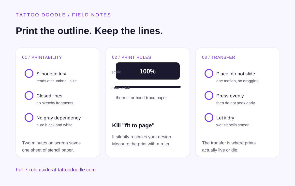
This guide is the second half of the stencil story. If yesterday's design workflow was about building a stencil from scratch, this one is about the other ninety percent of cases: you found an outline somewhere, and now you need it to land on skin. Four checks to run before you print, seven print rules that decide whether the transfer holds, and the mistakes I see at every consultation.
1. A Printable Outline and a Good Stencil Are Not the Same Thing
Here is the uncomfortable truth: most downloadable outline designs are illustrations, not stencils. They were drawn to be looked at — on a phone, on a portfolio page, in a Pinterest grid. A stencil outline has to be read by a machine or a hand and then read by a needle. Those are harsher readers than eyes.
The gap shows up in three specific ways:
- Hairline detail. Illustrators love fine inner lines — fur texture, petal veins, lace. On screen they add richness. In a transfer they merge into gray mush, because the transfer process has a minimum line it can carry. Detail below that minimum does not fade gracefully; it turns into noise.
- Gray fills and gradients. A pencil-shaded wing looks gorgeous online. Thermal copiers and hand transfers read in black and white. Grays either vanish or print as dirty texture, and neither is what you asked for.
- Wrong scale thinking. The file was designed at whatever size filled the artist's canvas. Your forearm is not that canvas. Without deliberate sizing, you get a bicep design printed at wrist size, and the detail that looked fine at six inches wide dies at two.
My rule of thumb, and the editorial take I give every friend who asks: treat every downloaded outline as a rough draft, not a finished stencil. Assume it needs one pass of cleanup — thickening, de-graying, sizing — before it touches paper. The ten minutes you spend doing that saves you the consultation where the artist has to say no.
2. The Four Printability Checks
Run these on the screen before you waste a single sheet of stencil paper. They take about two minutes total.
Check 1: The silhouette test
Squint at the outline, or shrink it to thumbnail size. Can you still tell what it is? If the design only reads at full size, the transfer will not rescue it — transfers lose fidelity, they never gain it. A printable outline reads at postage-stamp size. This is the fastest filter I know: it kills about half of all bad downloads in five seconds.
Check 2: Closed, confident lines
Trace the main contours with your eyes. Are the lines continuous, or do they break into sketchy fragments? Sketch-style broken lines are the single most common reason a print fails — every gap becomes a decision the needle has to make mid-stroke. For a transfer, you want outlines that a child could trace without lifting the crayon. If the design is all fragments, either find a cleaner version or accept that you will be inking the gaps in by hand (and telling your artist exactly where).
Check 3: No gray dependency
Look at what makes the design work. If you converted it to pure black and white right now — no grays, no shading — would it still read? If the answer is no, it is an illustration wearing a stencil's clothes. The fix is real but simple: either choose a line-only version, or do one cleanup pass where you decide which gray areas become solid black and which become empty skin.
Check 4: One size decision, made deliberately
Measure the design against the body part. Not "roughly," — actually hold a ruler to your forearm, your shoulder blade, your calf. Decide the real dimensions now, in inches, before you print. Every print setting downstream (scale, paper orientation, how many copies) depends on this number, and guessing it at the printer is how people end up with a back piece sized for a wrist.
3. The Seven Print Rules
These are the rules that decide whether the transfer holds. They are boring, mechanical, and they matter more than the design itself.
Rule 1: Print at one hundred percent. Always.
The number-one print killer is not a setting you chose — it is a setting your printer chose for you. "Fit to page," "shrink to fit," and "scale to paper size" are on by default in most print dialogs, and they silently rescale your design to fill the sheet. A design you sized at four inches comes out at four and three-quarter inches, or three and a quarter, and you will not notice until the stencil is on the skin. Set scaling to one hundred percent or "actual size," then measure the print with a ruler. The ruler is not optional. It is the whole rule.
Rule 2: Match the paper to the method
There are two worlds here, and mixing them up ruins prints:
- Thermal transfer: the design is printed (usually from a laser printer, because the thermal copier needs toner on the master sheet) onto thermal stencil paper, then run through the thermal machine. The machine does the flipping for you. If you are going this route, buy actual thermal stencil paper — regular paper through a thermal copier gives you nothing.
- Hand transfer: the design is printed on regular paper, then traced onto the skin with hectograph transfer paper, or the outline is redrawn directly. Here regular paper is fine, but the print needs to be dark and high-contrast, because you are reading it by eye.
Ask your artist which method they use before you print. Printing a beautiful thermal master for an artist who hand-traces is wasted money; bringing a faint inkjet print to a thermal workflow is wasted time.
Rule 3: Black ink, maximum darkness
Set your printer to its darkest black setting and, if the option exists, to print text/graphics rather than photos. Photo mode tries to preserve subtle tones — exactly the grays you do not want. You are not printing art. You are printing instructions. Instructions should be black.
Rule 4: Print a size test strip first
Before you commit an expensive sheet of thermal paper, print the design on cheap regular paper at two or three sizes around your target. Cut them out. Tape them to the body part. Live with each for a minute. Almost everyone discovers their "perfect" size is wrong — usually too small, because screens make everything feel bigger than it is. This test costs pennies and catches the most expensive mistake in the process.
Rule 5: Mirror only when your method demands it
Here is where people overthink. Thermal copiers flip the image as part of the process, so you print it reading normally. Hand-tracing methods need you to think about which side faces the skin — and if your design includes text, a mirrored print will tattoo mirrored text. The rule is simple: know your method, and if there is text in the design, double-check the orientation on the test strip before the real print. Mirrored lettering is the most embarrassing preventable error in stenciling.
Rule 6: Keep the source file untouched
Never edit your only copy. Work on duplicates. You will want to try three line weights, two sizes, and a cleaned-up version — and you will want to go back to the original at least once. Save the untouched download in a folder, and do every cleanup pass on a copy. Future you, comparing version four against the original at midnight, will be grateful.
Rule 7: One placement, one fresh print
Do not reuse a stencil print across placements, and do not print once and "see how it looks" on three body parts with the same sheet. Stencil paper smudges, hand-traced sheets pick up oils from your fingers, and every handling degrades the lines. Print fresh for the placement you chose. If you change the placement, print again.
4. From Paper to Skin: The Transfer, Step by Step
You have a clean print at the right size on the right paper. Now the transfer itself — the part most guides skip, even though it is where prints actually die.
- Clean the skin. Wash the area, shave if needed, and wipe with the stencil solution or green-soap mix your artist uses. Oils and lotion are the enemy: the transfer adheres to clean, slightly tacky skin, not to moisturizer.
- Apply the transfer fluid thinly. A thin, even layer — not a puddle. Too much fluid and the lines bleed; too little and they do not stick. This is the step with the most feel to it, and it is worth watching your artist do it once before you ever try it yourself.
- Place, do not slide. Lay the stencil down in one motion. Sliding smears. If the placement is wrong, lift and redo it with a fresh print — see Rule 7. A crooked stencil you "adjust" by dragging is a smeared stencil.
- Press evenly, then wait. Firm, even pressure across the whole design, then leave it alone for the time your artist specifies. Peeking early and re-pressing gives you a double image.
- Peel in one direction. Lift from one edge and peel back steadily. Then — and this is the part everyone rushes — let it dry completely before anything touches it. A stencil that looks perfect wet can still smear under a fingertip.
5. The Mistakes I See at Every Consultation
After watching this process from both sides, the same five failures repeat:
- The screenshot print. A phone screenshot, printed. Screenshots are low-resolution by definition; the lines that looked crisp at phone size turn to stair-steps on paper. If the design only exists as a screenshot, it is not printable — find the source file or redraw it.
- Fit-to-page amnesia. The designer measured everything, sized it perfectly, then printed with default settings. Measure the print, every time.
- Gray-line optimism. "It will probably transfer fine." It will not. Grays are the transfer's blind spot.
- The single precious print. One copy, handled five times, shown to three friends, taped to the mirror for a week — then brought to the appointment as a faded relic. Prints are cheap. Print fresh.
- Skipping the artist conversation. Every artist has a preferred method, preferred paper, and opinions about your design. A two-minute message — "I am bringing a printed outline, do you want thermal or hand-trace format?" — prevents all four mistakes above from mattering.
The Bottom Line
Printable outline tattoo stencil designs are a supply chain: screen to printer to skin, with a quality check at every handoff. The design is the least fragile link. The print settings and the paper are where it breaks, and they are also where it is cheapest to fix. Run the four checks, follow the seven rules, keep one untouched source file, and bring your artist a stencil that makes their job easier instead of harder. That is the whole game — and it is entirely winnable from your kitchen table.
FAQ
Can I just print any tattoo outline I find online and use it as a stencil?
Only after the four printability checks in this guide. Most online outlines are illustrations optimized for screens: hairline detail, gray shading, and arbitrary sizing. They need one cleanup pass — bold closed lines, pure black and white, deliberate sizing — before they transfer cleanly. A raw download printed as-is fails more often than not.
Should I use thermal stencil paper or regular paper?
It depends on your artist's transfer method. Thermal stencil paper is for machine transfer: you print the design (usually via a laser printer) onto the master sheet and run it through a thermal copier, which flips and transfers it. Regular paper works for hand transfer, where the design is traced onto skin with hectograph paper. Ask your artist which method they use before you print — the wrong paper for the method wastes both.
Why did my printed stencil come out the wrong size?
Almost always the print dialog's scaling setting. "Fit to page" or "shrink to fit" is on by default in most printers and silently rescales your design. Set scaling to one hundred percent or "actual size," then measure the print with a ruler before you commit stencil paper. If the measurement does not match your intended size, the setting is still wrong.
Do I need to mirror the design before printing?
Only if your transfer method requires it. Thermal copiers flip the image automatically, so you print it reading normally. For hand-tracing methods, check which side faces the skin — and if the design contains any text, verify the orientation on a test strip first. Mirrored lettering is a common and completely preventable error.
How many copies should I print?
At minimum: one size-test print on cheap paper (often at two or three sizes), plus one fresh final print on the correct stencil paper for the chosen placement. Never reuse a handled print for the real transfer — every touch degrades the lines. Prints are cheap; a smeared stencil at the appointment is expensive.