Tattoo Styles: What Every Major Style Is, How It Ages, and How to Choose Yours
Confused by tattoo styles? A field guide to the major styles — traditional, neo-traditional, blackwork, black-and-gray realism, fine-line, and color styles — how each one ages over ten years, and a practical method for choosing the style that fits your design, your skin, and your life.
Quick answer
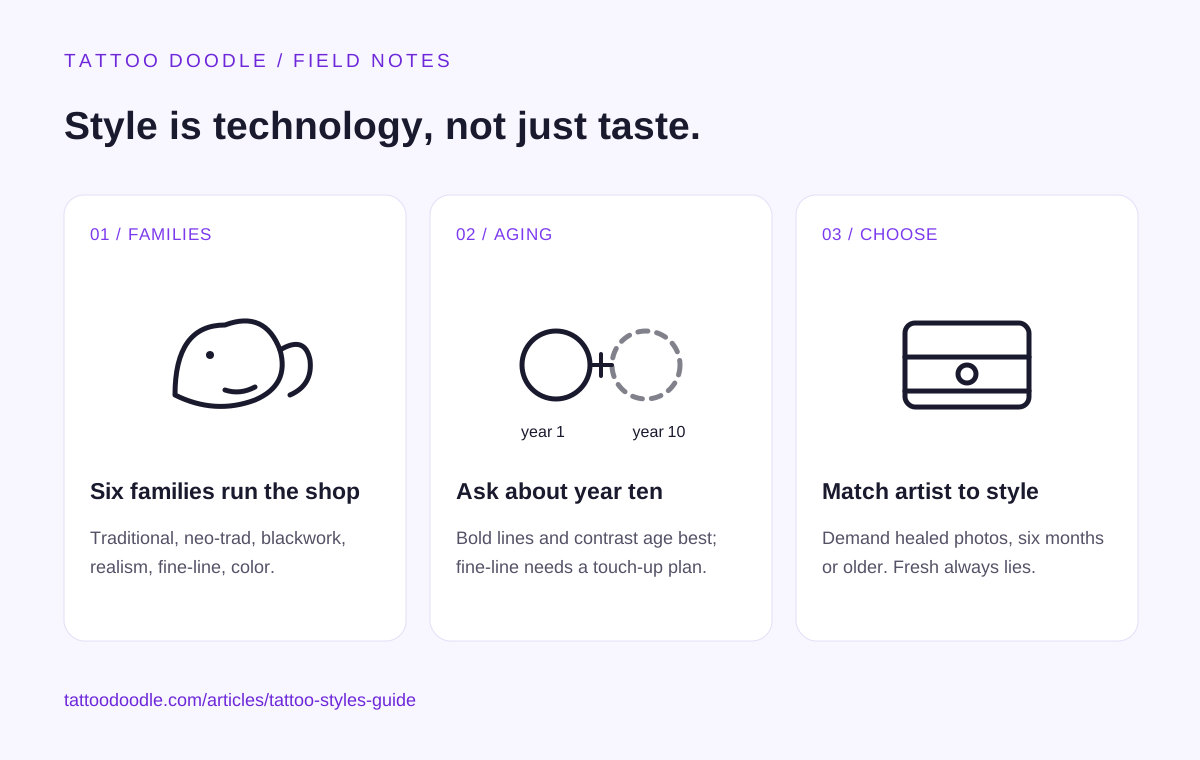
The major tattoo styles are traditional (American/Old School), neo-traditional, blackwork, black-and-gray realism, fine-line/minimalist, and color styles like new school and watercolor. The style you pick is a technical decision, not just an aesthetic one: bold lines and high contrast age the best over a decade, fine-line and watercolor age the worst. The fastest way to choose is the aging test — ask what the style looks like at year ten, not year one — and then verify the artist's healed portfolio, not their fresh photos.
Walk into a tattoo shop's portfolio and the first thing that hits you is the variety: a bold eagle that could be from 1955, a photorealistic portrait, a single-line botanical that looks drawn with a needle's needle. These are not just different drawings — they are different technologies. A tattoo style is a bundle of technical decisions: how thick the lines are, how shading is built, how color is packed, how much contrast the design carries. And those technical decisions determine the one thing most people never think about until it is too late: how the tattoo looks in ten years.
This guide covers the styles you will actually encounter, what each one is good at, the honest aging story for each, and a practical method for picking the one that fits your design, your skin, and the body you plan to live in.
1. Stop Thinking of Styles as Aesthetics
Here is the reframe that makes everything else in this guide click: a tattoo style is a set of trade-offs between beauty now and legibility later. Ink in skin is a decaying medium. Lines spread slightly over years (ink migration under the skin is normal, not a mistake). Colors fade at different rates — yellows and pastels fastest, blacks slowest. Fine details blur into each other.
So every style sits somewhere on a spectrum. On one end: styles engineered for maximum longevity — thick lines, heavy contrast, simple shapes. On the other: styles optimized for immediate beauty — delicate lines, subtle gradients, painterly effects. Neither end is wrong. But you should know which end you are standing on, because the tattoo you pick today is the tattoo you wear at forty, sixty, eighty.
I call this the ten-year test: when you fall in love with a style, do not ask "does this look incredible?" Ask "what does this look like at year ten?" A style that still reads clearly at year ten is a good technical choice. A style that dissolves into a soft blur at year ten is still fine — if you go in with your eyes open and plan for touch-ups. What you do not want is to pick a fragile style expecting permanence. Most tattoo regret is not about the design. It is about the surprise.
2. The Six Style Families You Will Actually Meet
Forget the endless micro-labels. In practice, working artists cluster into six families. Learn these and you can read any portfolio.
Traditional (American Traditional / Old School)
The sailor-tattoo canon: eagles, anchors, daggers through hearts, pin-up figures. Bold black outlines, a limited palette (black, red, green, yellow), minimal shading, flat and graphic. This is the style that has been aging on human skin the longest — we have seventy-plus years of evidence — and it ages the best of any style in existence. The bold lines hold, the high contrast keeps the design readable, the simple shapes do not blur into mush. If your top priority is "still looks like itself in twenty years," this is the answer. The trade-off is stylistic range: it does one thing, loudly. It does not do subtle, and it does not do photorealism.
Neo-Traditional
Traditional's more ambitious younger sibling: same bold-outline DNA, but with a broader color palette, more detail, decorative elements, and realistic-ish faces and animals. Think of it as traditional with a bigger toolbox. It ages nearly as well — the bold outlines do the structural work — while allowing much more complex designs. If you love the punch of traditional but want more illustrative detail, this is usually the sweet spot for aging versus artistry.
Blackwork
A big umbrella: geometric patterns, dotwork mandalas, tribal-adjacent black pieces, ornamental designs, and increasingly large-scale blackout work. The unifying trait is black ink doing all the heavy lifting — no color, shading built from dots, hatching, or solid fills. Aging depends entirely on the construction: heavy blackwork (solid fills, bold shapes) ages superbly, among the best; fine dotwork and delicate geometry age like fine-line (see below) because they rely on tiny details that spread. When you look at a blackwork portfolio, look past the style and ask: is this built from bold masses or delicate filigree? The masses last.
Black-and-Gray Realism
Portraits, animals, horror imagery, Chicano-style lettering and imagery — built from black ink diluted to grays, shaded smoothly like a pencil drawing. This is the style of technical showmanship, and at its best it is breathtaking. The aging story is genuinely good if the artist builds contrast into it. The failure mode: realism done too softly, all mid-tones and no deep blacks, which fades into a gray haze within years. Good realism artists think in value ranges — deep darks next to bright skin — and that contrast is what survives. Ask to see healed realism photos specifically. Fresh realism always looks spectacular; healed realism separates the technicians from the artists.
Fine-Line / Minimalist
Single-needle or tight-liner work: delicate botanicals, tiny symbols, script, micro-realism. The Instagram era's signature style. Be honest with yourself about the aging: this is the most fragile mainstream style. Hairline lines spread, tiny details merge, and a design that is exquisite at year one can be a soft gray smudge at year eight. That does not make it a bad choice — millions of people choose it knowingly and love it — but it makes it a choice with a maintenance plan. Budget for a touch-up every five to eight years, keep the design simple rather than intricate (fewer details = less to lose), and place it where sun exposure is low. The people who regret fine-line are almost always the ones who were never told this.
Color Styles: New School, Watercolor, and Illustrative Color
New school: cartoonish, exaggerated, saturated — the bold-line philosophy applied to color. Ages well, because it inherits traditional's structural advantages. Watercolor: painterly splashes and gradients with little or no black outline. Beautiful, and the most controversial aging story in tattooing — without black outlines to anchor the design, fading color can leave something that reads as a bruise rather than a painting. Skilled watercolor artists compensate with strategic black accents and saturated color packing; ask how, and look at healed work. Between these poles sits a large illustrative-color world (anime, storybook, painterly realism) — aging quality tracks directly with how much bold structure sits underneath the color.
3. The Aging Hierarchy (Year Ten, Honest Version)
If I had to rank the families by how they look a decade in, with average sun exposure and no touch-ups, the order is:
- Traditional and bold blackwork — still crisp, still readable. The gold standard.
- Neo-traditional and new school color — bold structure carries them; color softens but the design holds.
- Black-and-gray realism (well-built) — softens but stays legible; quality of the artist matters enormously here.
- Delicate blackwork / dotwork — fine details merge; bold elements survive.
- Fine-line / minimalist — significant softening; often needs a touch-up to stay sharp.
- Watercolor without black structure — the most variable; can fade into ambiguity.
Two caveats. First, aftercare and sun matter more than style. A fine-line tattoo on a sun-protected inner arm, kept moisturized and out of UV, will out-age a traditional piece baked in the sun for a decade. Sunscreen on tattoos is not vanity; it is the single highest-leverage aging intervention that exists. Second, skin tone interacts with style: on deeper skin tones, high-contrast styles (bold blackwork, traditional) read more reliably than subtle gray-wash or pastel color, because contrast against the skin is what the eye reads. A good artist will tell you this unprompted during the consult. If they do not, ask.
4. How to Actually Choose: The Four-Filter Method
Enough theory. Here is the practical sequence I recommend:
Filter one: the ten-year test. Rank your shortlisted styles by the aging hierarchy above. If you are twenty-two and getting your first tattoo, weight this filter heavily — you will wear this longer than you have been alive so far. If it is a small piece you are comfortable refreshing, weight it less.
Filter two: the design's native style. Some designs have a home style. A memorial portrait wants black-and-gray realism. A sailor eagle wants traditional. A wildflower sprig wants fine-line. Fighting the design's native style — say, a photorealistic portrait rendered as a watercolor — usually produces a worse tattoo than either style would alone. Let the subject pick the style, then pick the artist.
Filter three: the healed portfolio test. This is the filter that actually protects you. When you find an artist whose style matches, ask to see healed photos — six months or older. Every style looks good fresh. The healed portfolio shows you what that artist's version of the style becomes. An artist who cannot or will not show healed work in your chosen style is telling you something. Listen.
Filter four: the consult honesty check. Describe what you want, then ask: "How will this look in ten years, and what would you change to make it age better?" A good artist will give you a straight answer, possibly suggesting bolder lines, more contrast, or a larger size. An artist who promises any style ages perfectly is selling, not consulting. The consult is a refinement step, not a rescue mission — use it.
5. Mixing Styles: The Rules
Can you mix styles on one body? Yes — most heavily tattooed people do. The rules are simple: keep each piece internally consistent (a traditional eagle next to a fine-line sprig is fine; a half-traditional half-realism single piece is usually a mess), and think about visual weight across the body (one massive bold piece next to a tiny delicate one can look accidental — plan the composition, or at least the size relationship). Sleeves that blend styles work when there is a unifying element: consistent black line weight, a shared background (smoke, wind bars, dotwork filler), or a single color story.
One more honest note: the style you get first often becomes your collection's anchor. People tend to keep collecting in the style of their first good tattoo, because it sets the visual language. So the first-tattoo style choice matters disproportionately. Choose it like it is the first chapter, not a standalone sentence.
FAQ
What is the most popular tattoo style right now? Fine-line and minimalist styles dominate social media, and black-and-gray realism dominates large custom work. But popularity is a poor guide — traditional and neo-traditional remain the most consistently requested styles in working shops year after year, because they deliver the best ratio of beauty to longevity. Pick for your decade, not the algorithm's week.
Which tattoo style hurts the least? Pain tracks placement, session length, and technique more than style. That said, fine-line sessions tend to be shorter (less pain overall), while heavy blackwork and dense color packing — which require more passes over the same skin — tend to hurt more per square inch. Realism sessions are long, which is its own kind of endurance test.
Which tattoo style is best for a first tattoo? For most first-timers, I point to neo-traditional or a bold illustrative style: forgiving aging, wide design range, and easy to find skilled artists. If you want fine-line for your first, go in knowing the maintenance story (touch-ups every five to eight years) and keep it simple. Avoid getting your first tattoo in a style your artist does not specialize in — the artist-style match matters more than the style ranking.
Can any artist do any style? Technically many can; well, few can. Style is muscle memory built over thousands of hours. A realism specialist doing their first traditional piece will produce a worse traditional tattoo than a mid-level traditional specialist. Always match the artist to the style, verified by their healed portfolio — not their Instagram highlights.
Do tattoo styles go out of fashion? Motifs cycle (tribal had its era, watercolor had its boom), but the core style families are stable — traditional is a century old and still growing. If you are worried about datedness, anchor the tattoo in a classic family rather than a trend peak, and choose imagery with personal meaning over imagery that is merely current. Meaning does not expire.
How do I find artists who specialize in a specific style? Search the style name plus your city, then audit: consistent style across the portfolio (not one of everything), healed photos available, and a waitlist — genuinely good specialists usually book weeks out. Convention guest spots and shop portfolios are better hunting grounds than hashtag browsing, because you can see the work in person.