Name Tattoo Lettering: Compare a Full Name and Initials
Plan name tattoo lettering with a full-name and initials comparison, spelling checks and a clear artist reference. Explore layout choices without size guarantees.
Quick answer
Confirm the exact name and spelling, then compare the full name with an initials option. Keep dates separate while deciding the lettering, and proofread every exported reference before sharing it.
A name can be the entire design or one element in a larger reference. Before choosing a decorative font, decide which form of the name matters to you: a first name, a full name, initials or a name paired with a date. Each gives your artist a different starting point.
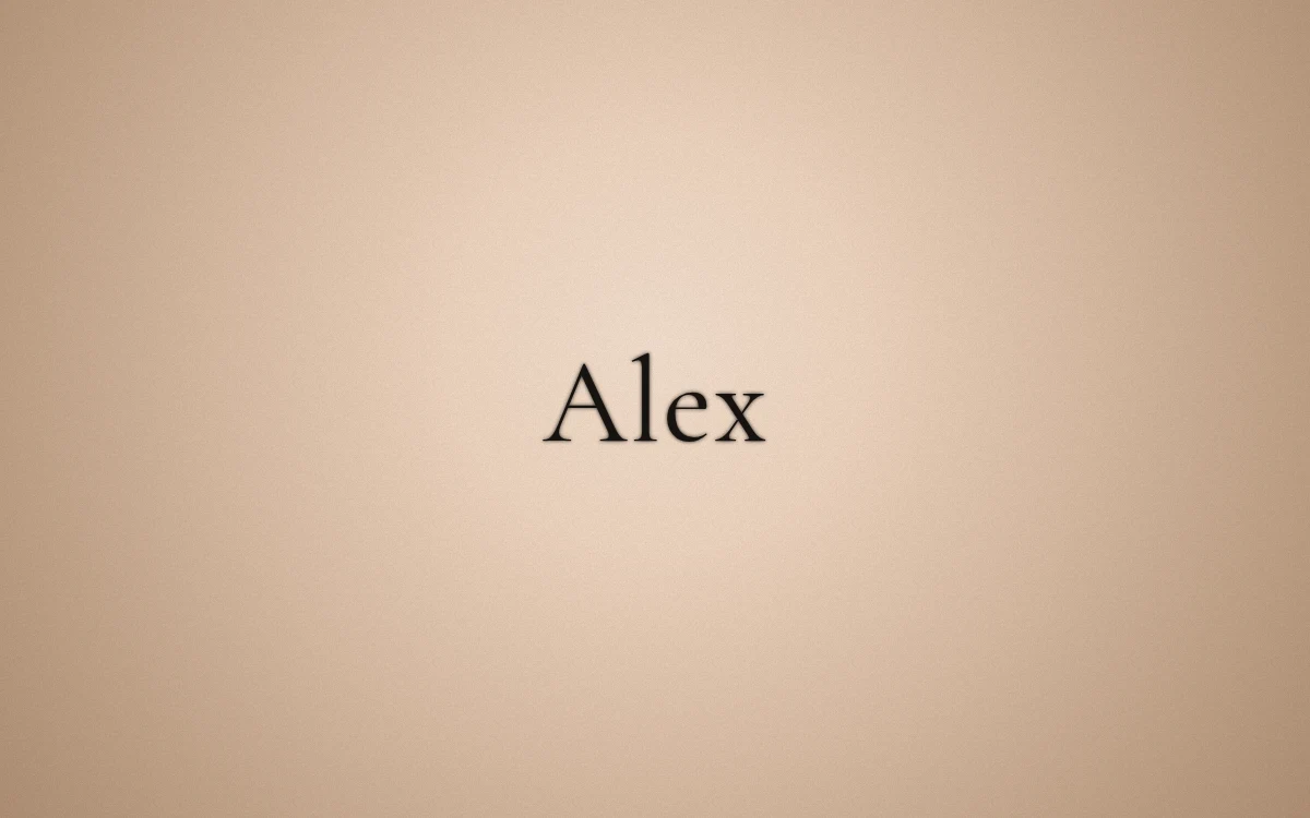
Alex is an example name used to demonstrate a real digital font preview. It is not a customer story or a photograph of a finished tattoo.
Confirm the exact form of the name
Write the name in plain text first. Check spelling, capitalization, accents, hyphens and spaces against a trusted original. If there are several accepted forms, choose deliberately rather than letting a font's appearance decide for you.
Names in another writing system need an independent language check. A font loading successfully does not verify the wording or guarantee that every character is represented correctly. Treat any missing-character warning in the preview as a reason to stop and resolve the issue before exporting.
Compare a full name with initials
A full name preserves more of the wording; initials give a shorter visual arrangement. Neither choice has one correct mood. Compare them as two distinct concepts instead of trying to squeeze a full name into the space occupied by a single letter.
Ask yourself what must stay recognizable. If the name is the central meaning of the design, can another person identify it from the preview without being told what it says? If you prefer initials, keep the full spelling in your private notes so the intended letters remain unambiguous.
Choose a lettering direction before adding ornaments
Try the name in a restrained script and a structured serif. Keep the spelling identical. Look at the first capital, repeated letters and the ending of the name. A large flourish can attract attention away from the rest of a short word.
The lettering studio lets you type the name and compare available fonts. Save a small shortlist. The font comparison guide explains why three different directions can be more useful than dozens of nearly identical screenshots.
Add a date as a separate decision
If the design includes a date, verify it independently and write the month as a word in your checking notes. A short numerical date can have different meanings in different regional formats. Do not assume that someone reading your reference will infer the order you intended.
Consider whether the name and date should have equal emphasis. You can describe a preferred hierarchy to your artist without pretending a flat preview has settled the final arrangement. If a two-line composition matters, say so explicitly rather than relying on one line of text to imply it.
Prepare a useful artist reference
Choose one preferred direction and one alternative. Save a PNG or make a reference card, and keep the exact name and date in plain text alongside it. Explain which elements are essential and which are open to your artist's interpretation.
The reference is not a ready-to-transfer stencil or a final placement decision. Ask your artist about the lettering, size, position and any custom redraw. Proofread the final artwork again after those changes, especially if an accent, initial or digit has been adjusted.
Make your own
Explore a tattoo concept with the AI generator (free usage is limited), preview lettering with the free font tool, or try a placement preview. AI design references are not professional tattoo-ready stencils.